
(Original)

In this photo I edited the photo filter to bring out a darker purple in the flower. I also selected the mosaic tiles texture and like how it came out looking like a blurry painting- almost a watercolor! I can see myself using this texture for prints on stationary :)
(Original)

Here I went under brightness/contrast and selected soft light, then deep red and loved how that came out. I kept playing around with a few more tools/selections, but found it hard to remember what I used- I even tried writing it down, but kept crossing things out when I found it didn't work! But this was fun to see how many things you can do to a photo by changing the light/color/texture.
It's kind of funny that once I started playing around with the light and color adjustments, I wondered why I even thought the originals were good photos. It's crazy how these minor adjustments enhance the photo so much and is more aesthetically pleasing!
I love the alterations you made to your photos. In the first picture the purple flowers definitely stand out more than the original. The second photo is just all around a much better photo! So vibrant! Great job.
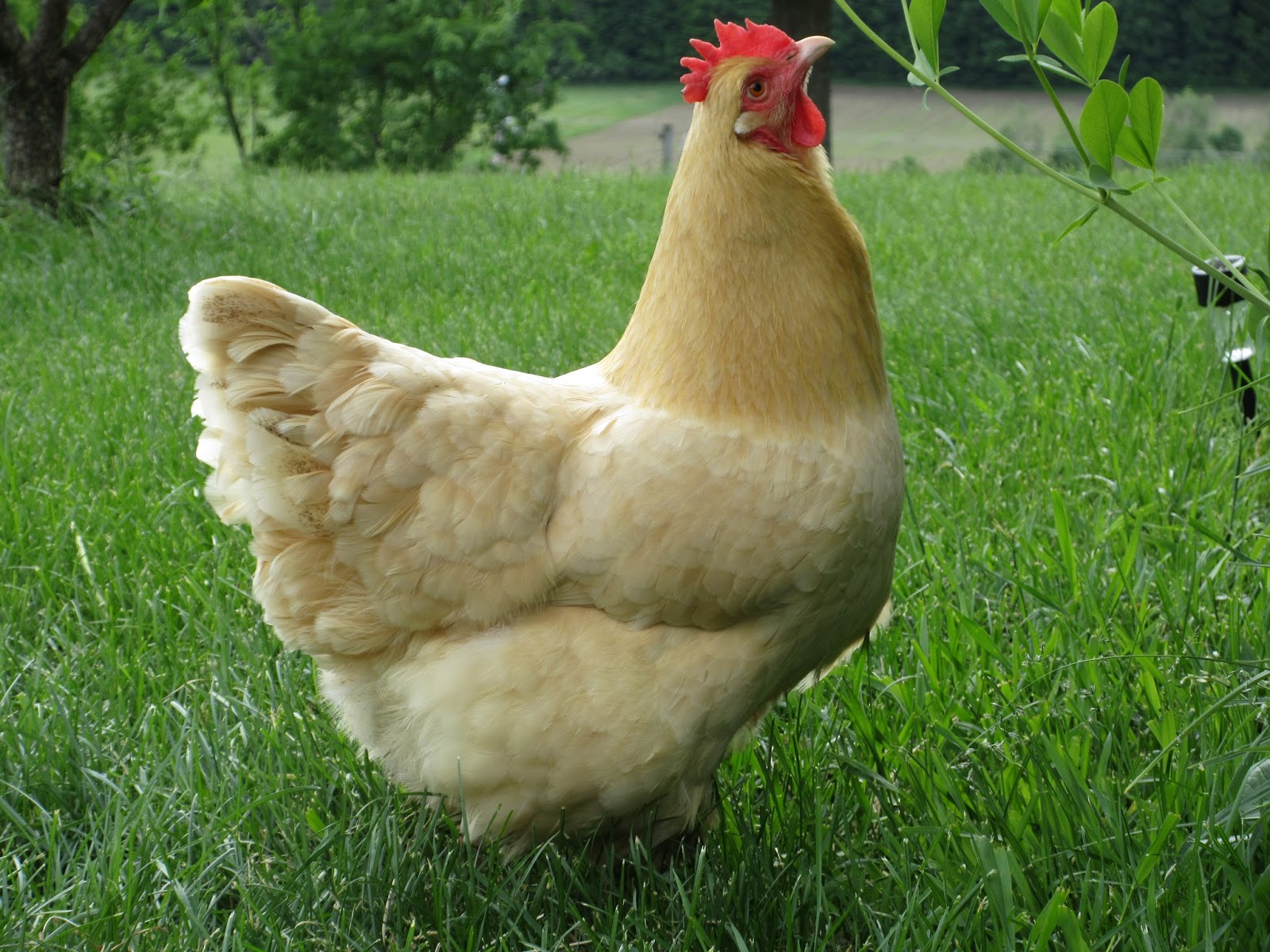
ReplyDeleteI think the picture of the chicken turned out much more vivid than the original.
ReplyDeleteNice job with the chicken, the original photo looked a little washed out but the adjusted one looks great!
ReplyDeleteI really like that you tried to write down your steps and then find yourself backtracking to go down another path. This means you are exploring and trying to find a way to satisfy your creative self. It is an endless journey. The key is to just keep playing with the tools. Great work on these!
ReplyDeleteYou did a nice job with these photos. The first one takes a little bit of time to look at it to really see the big difference but I love how you enhanced it to look like a watercolor piece. Also enhancing the chicken's colors looked awesome too!
ReplyDeleteYou did a nice job with these photos. The first one takes a little bit of time to look at it to really see the big difference but I love how you enhanced it to look like a watercolor piece. Also enhancing the chicken's colors looked awesome too!
ReplyDeleteThe first photo is great. I like how you emphasized the color of the flower. I think this was very successful. The second photo is also well done with the way you changed the color. It almost makes the chicken look fake, or more like a painting. Well done!
ReplyDeleteLove the chicken photo - love the crispness of the photo. I also like the dark purple color in the first photo.
ReplyDeleteThe chicken photo is lovely! I love how the contrast makes the color of the chicken really pop. The sharpness of the texture is really nice too.
ReplyDeleteThe chicken photo is lovely! I love how the contrast makes the color of the chicken really pop. The sharpness of the texture is really nice too.
ReplyDelete