Before I started taking pictures for this assignment, I knew I wanted to capture a lot of patterns; textures and lines. I started in my yard and ended up driving back roads through Starksboro, Monkton and Charlotte. I think all of my pictures demonstrate what I was going for with these landscapes. I could take landscape pictures all day!
Thursday, June 30, 2016
Thursday, June 23, 2016
Rule of Thirds
I had a hard time finding an object I really wanted to take a picture of. I probably just need to just change up my setting but these were the shots I liked the best. I definitely think the photograph showing the rule of thirds is more "artsy" and interesting, but I like the one straight on better because of the two wood textures being so centered behind the flowers. I can understand why someone would use the rule of thirds and will be giving it another shot ;)
Wednesday, June 22, 2016
[ F R A M I N G ]
I had a lot of fun using this technique and can't wait to use it again in a different setting! It was a little trickier than I thought it would be but was up for the creative challenge! I think the shot of my cat peering through the chair and the chicken coop across the street were the most effective shots I got that demonstrated framing. Here are some of the shots I got:
Composition & Aesthetics
I found a lot of great links about aesthetics and composition and have a much better understanding of the general "rules" in photography. One quote I found that I thought captured the meaning of aesthetics was :
"Aesthetics in photography is how people usually characterize beauty in this art from. There exists no single consensus on what is exactly pertains to. The broad idea is that photographic images that are pleasing to the eyes are considered to be higher in terms of their aesthetic beauty"
http://infolab.stanford.edu/~wangz/project/imsearch/Aesthetics/ECCV06/datta.pdf
I would definitely read the entire article if you haven't already.
Aesthetics definition: the philosophy of art; is the study of beauty and taste. It is about interpreting works of art and art movements of theories.
Basically, any photograph that draws you in to take a deeper look and that gives you a certain feeling or connection to the image.
I also found some great links about composition:
http://www.photographymad.com/
http://digital-photography-
Both are very informative about the "rules" to follow in enhancing the quality of a photograph. I found interesting advice from the first link that states "The 'rules' above should be taken with a pinch of salt. If they don't work in your scene, ignore them." However, you should learn the different types of composition so you can use them when you want to!
Friday, June 17, 2016
Lighting
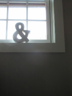
I took pictures of my wooden ampersand decoration in quite a few different lighting situations; mostly with natural light indoors. I found I didn't get the pictures I wanted with indoor natural light and lights turned on together. I had fun trying to find some creative lighting! Here are my favorites:
(This was the only picture I took that worked with the lights on and natural light- I liked all the shades of white)
(This is with no lights on and the sun setting through the window)
(This is natural light streaming through a door with no other lights on)
(This was my favorite-- light from the freezer, kind of getting dark outside but no indoor lights on)
(This was natural light with no other lights on)
(This is outside with the sun setting behind it)
Monday, June 13, 2016
Monday, June 6, 2016
Compare & Contrast One Object, Many Views
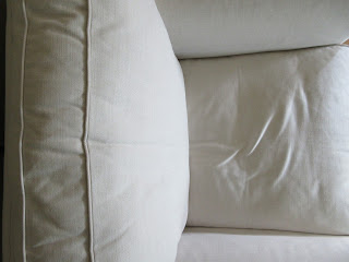
I was really surprised to look back through all the pictures I took of this one white chair and not being able to select my favorites as easily as I thought. I liked all the of the angles I was able to capture. I chose the first picture because of the lines of the chair being so neat from just above the object. I also really liked the defined texture the seams of the chair has and how the light is streaming in from the corner which creates another line along the fabric. This picture was my favorite because of how the lines, shading and light all look together on such a small portion of this chair.
The second I chose because who doesn't want to be in this chair? I was able to capture more surface area of one cushion by having my camera on the surface edge. I really liked how close the shot is from the cushion and how it's so centered. Also the light was perfectly in the center as well, so just a very uniform picture. Being a white chair, it only seems fitting to have such clean lines.
Subscribe to:
Comments (Atom)


